Effortless
Undergarments & Swimwear Inspired by Italian Holidays
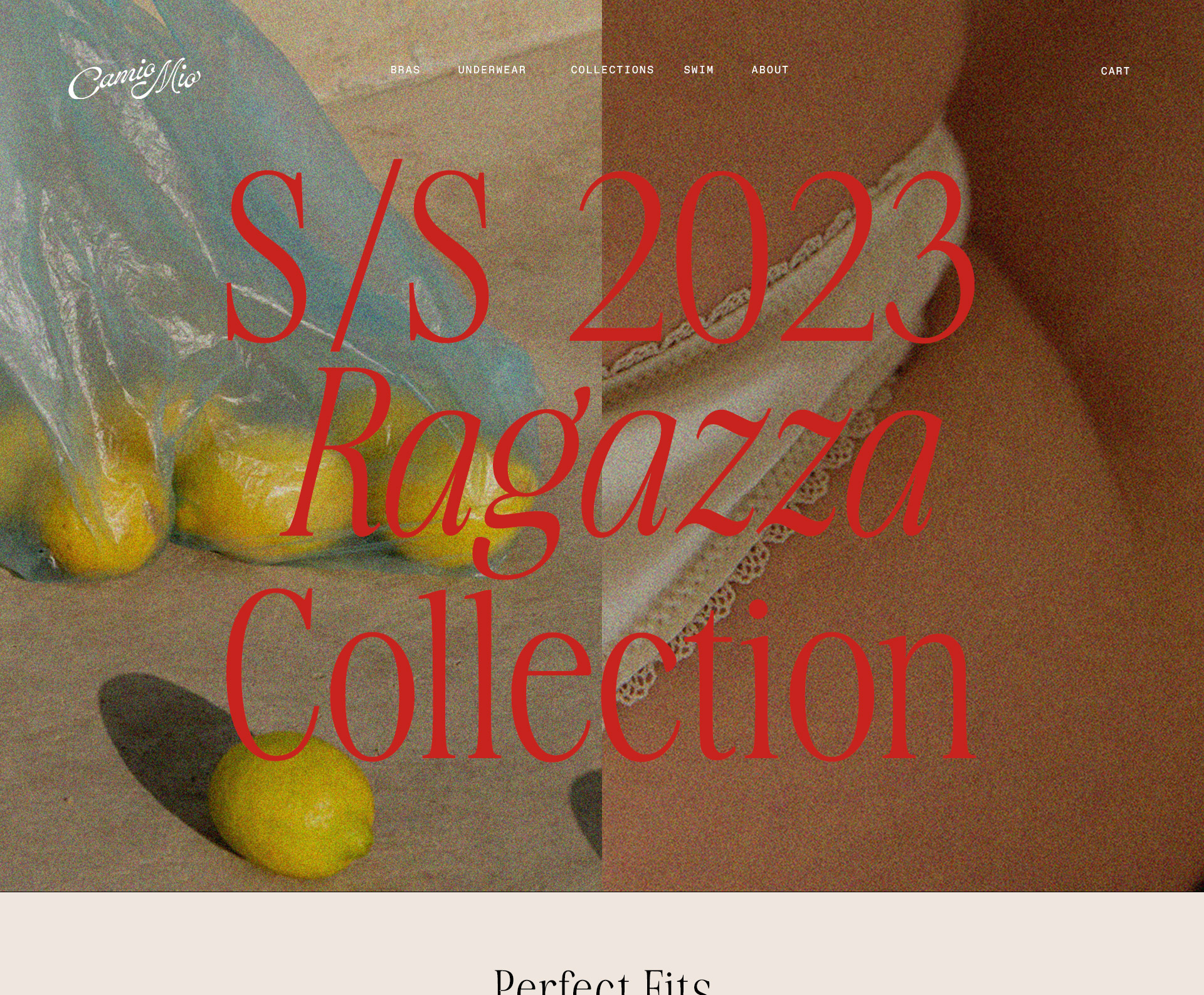
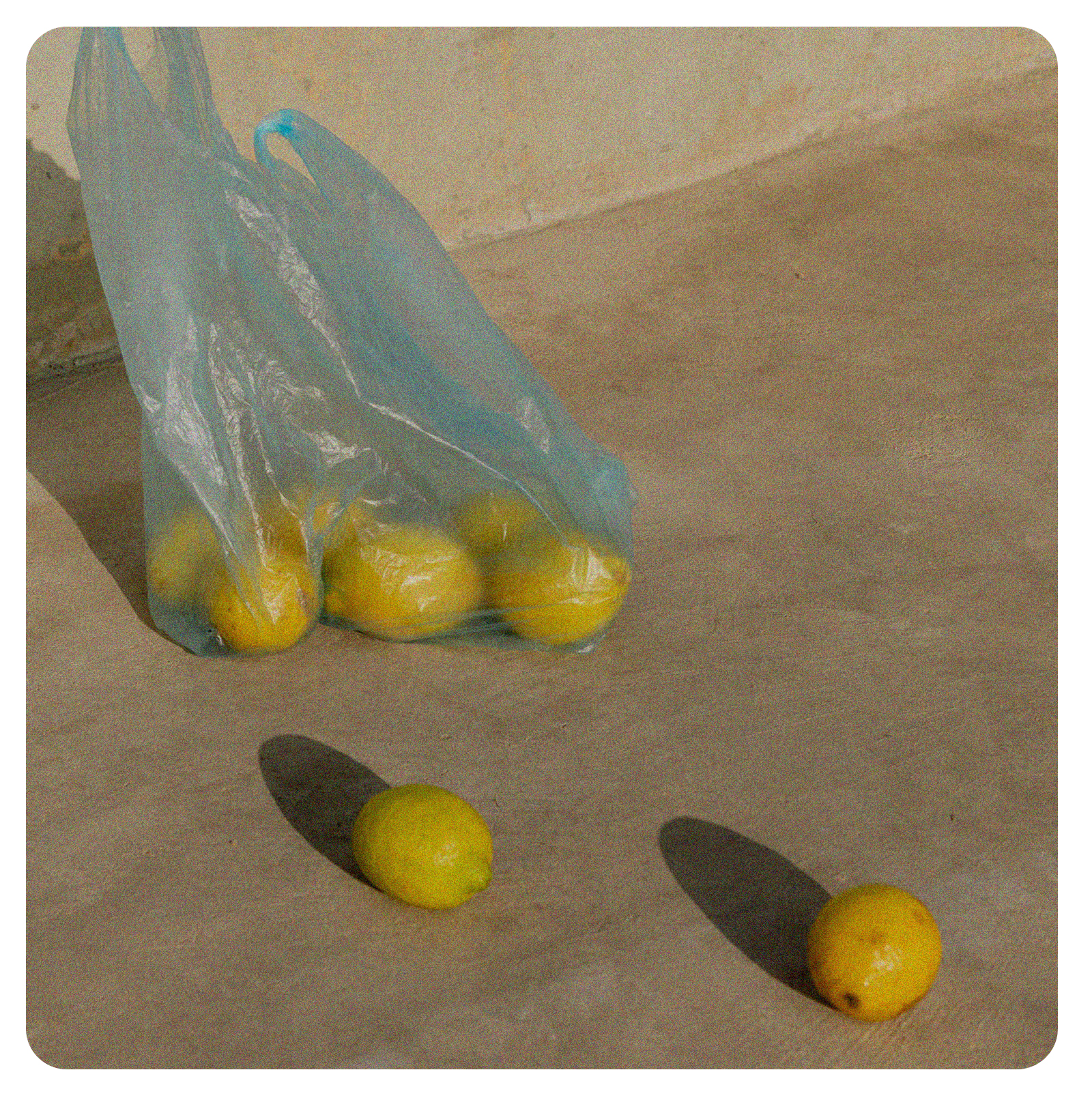
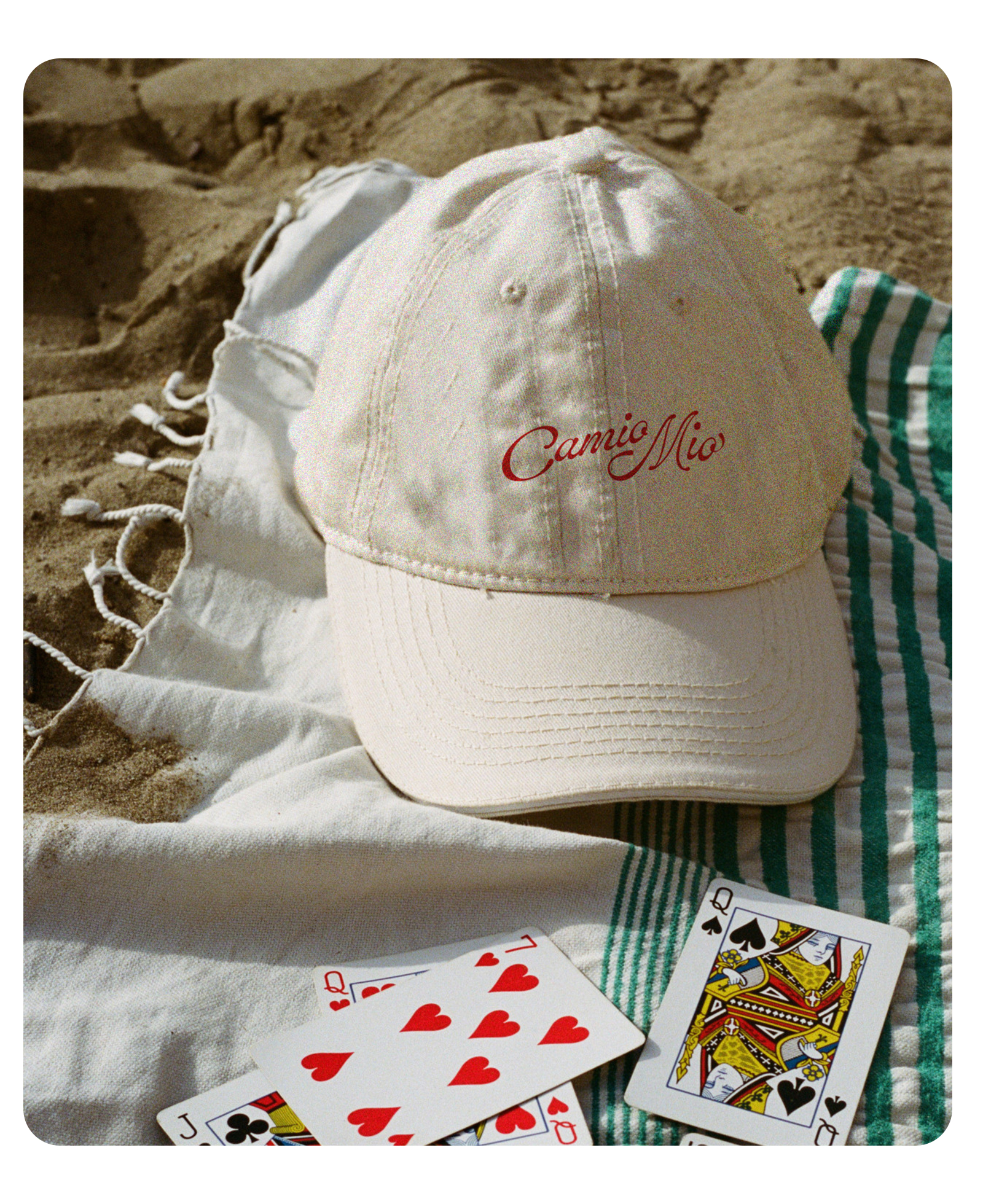
Camio Mio is an effortlessly cool undergarment and swimwear brand that draws it's inspiration from a holiday on the Italian coast. Like laundry hanging from a window drying in the sun, the brand wanted to evoke a visual identity that tapped into the nostalgia of fruit carts, summer fruits, and hand-drawn signs mixed with a classic but minimal appeal. I developed the branding to make that quick connection and connect with an audience that craves thoughtful design elements juxtaposed against wonderfully scaled-back luxury.
PHOTO: PAROLE DURE, DANIEL FARÒ, CHRIS ABATZIS
VIDEO: PAROLE DURE
Color
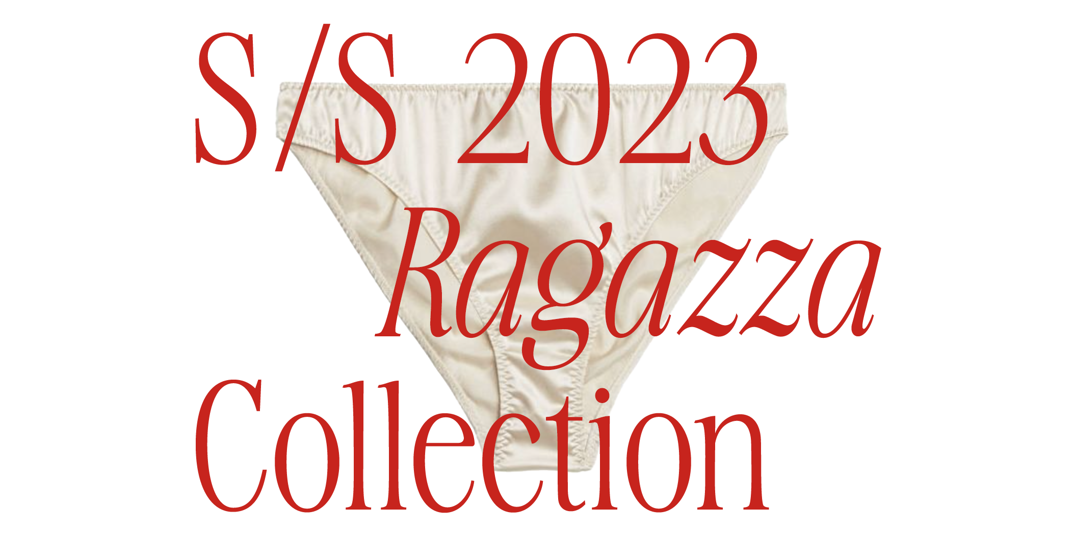
Colors and typography are reminecent of classic food packaging and hand-painted signage. The darker colors in the palatte are desaturated while the lighter provide a energetic pop. Typography is a mix of classic, tall serifs and monospace body text to balance high and low elements.

Logo

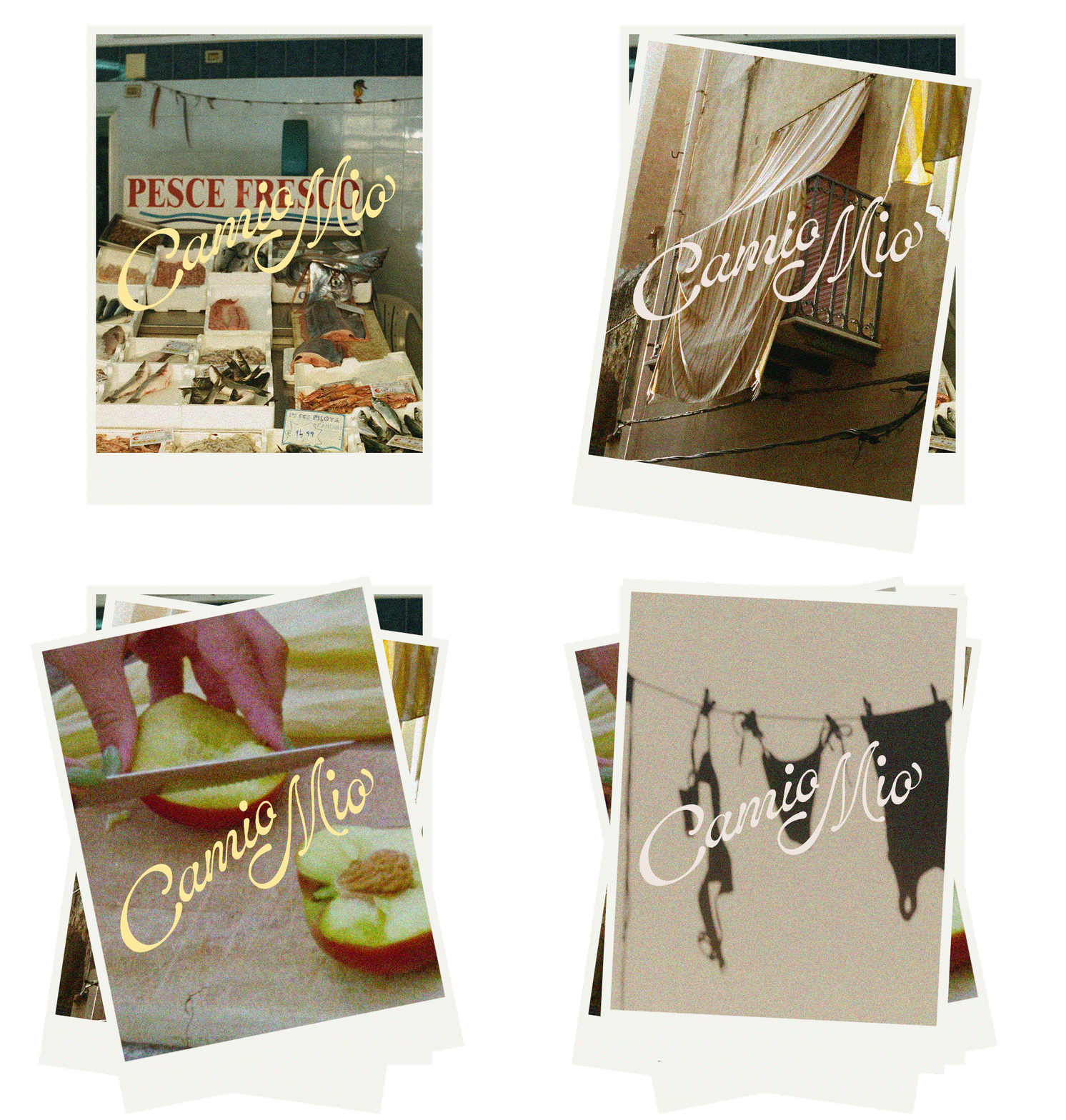
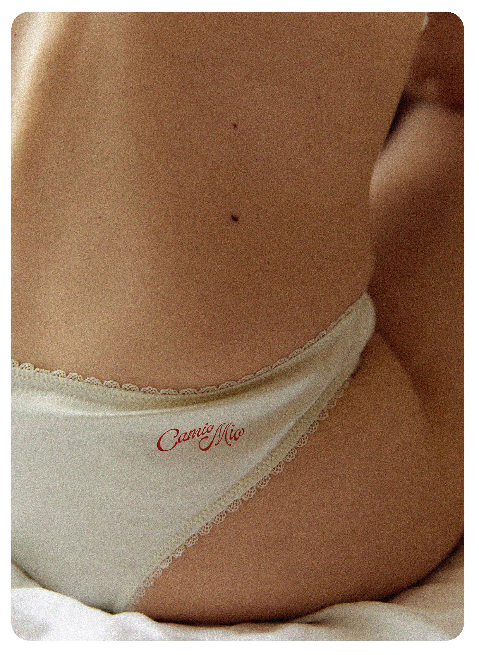
Camio Mio's logo is inspired by the playful movement of classic sign paintings. It is light hearted but nostalgic and is a repetitive feature of the brand. It appears on most apparel items as part of the signature identifier for the line.
FONT: ED LAVONIA
PHOTO: PAROLE DURE
PHOTO: DANIEL FARÒ
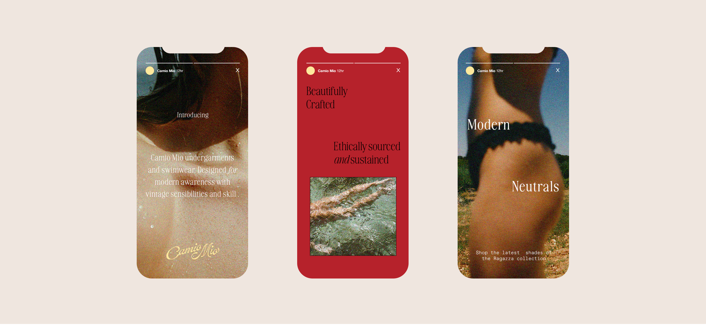
Digital Application
