Merit Beauty
Creative Development
Merit is a high-end, minimalist beauty brand born out of a ‘makeup with skin benefits’ concept. Began in 2017 and created in the brand incubation team at Who What Wear, we wanted to create a line that would resonate with the core fashion-obsessed, professional audience.
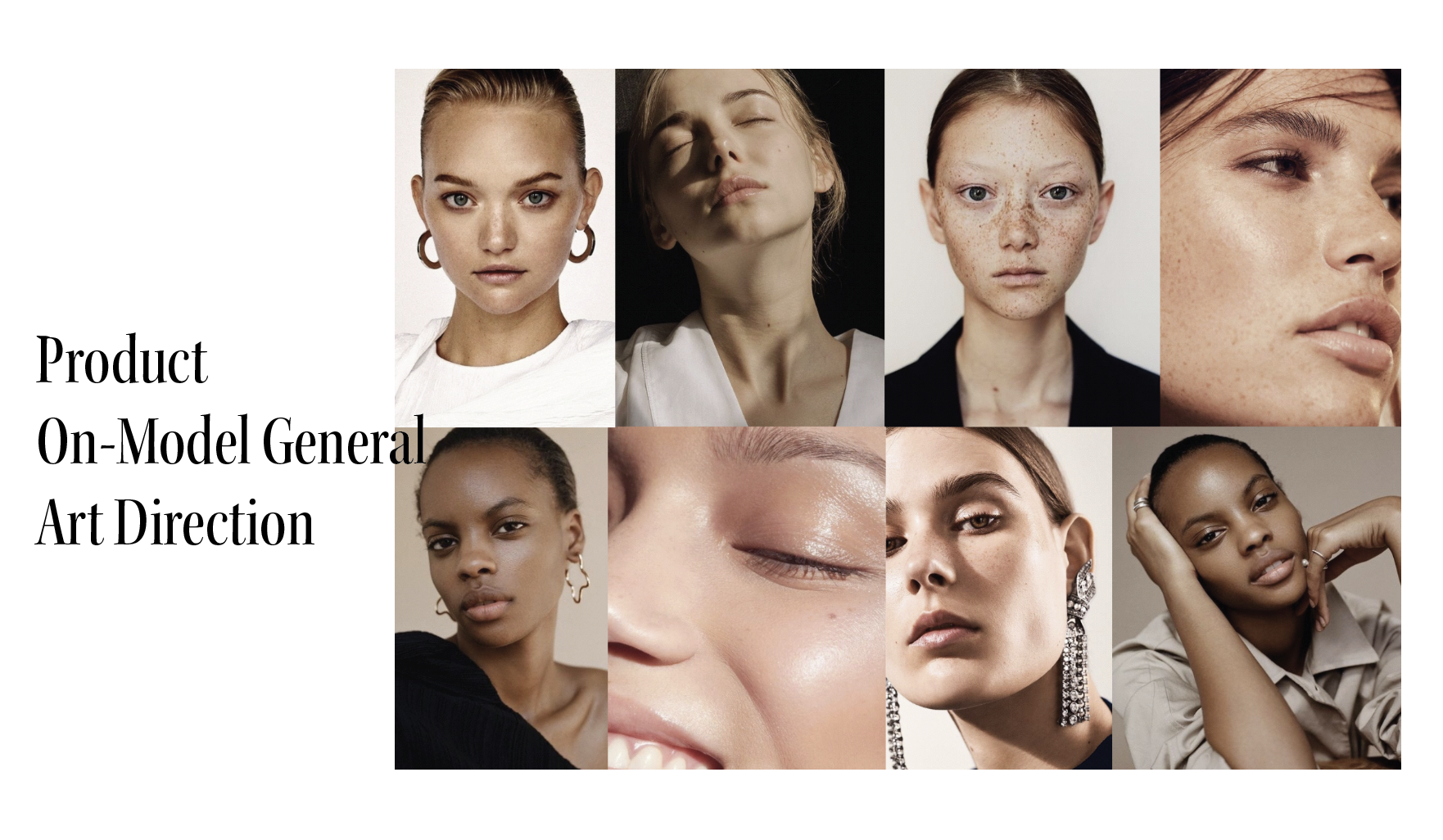
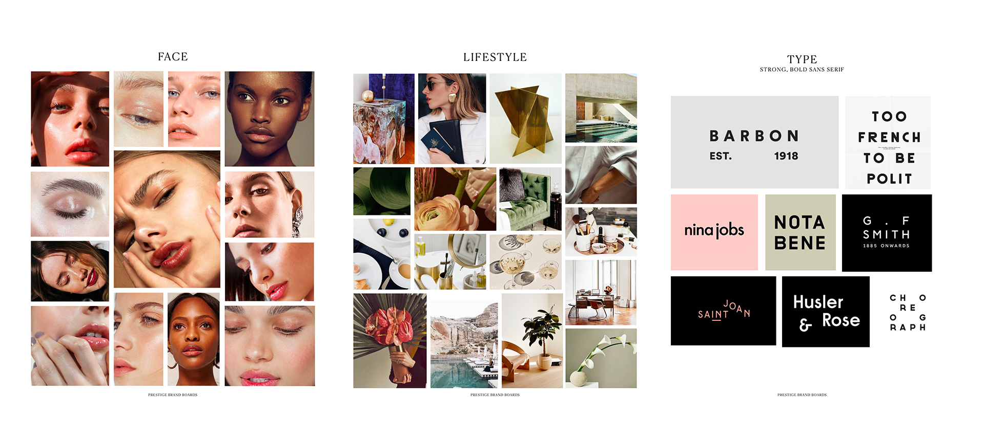
Utilizing the data from top-preforming articles and social posts, I crafted several mood boards synthesizing what this brand would look and feel like to speak to this target demographic. It was important to develop a clear consumer’s psychographic beyond just demographics to create a fully fleshed out direction and positioning. A small sampling of the study can be seen below.
Logo
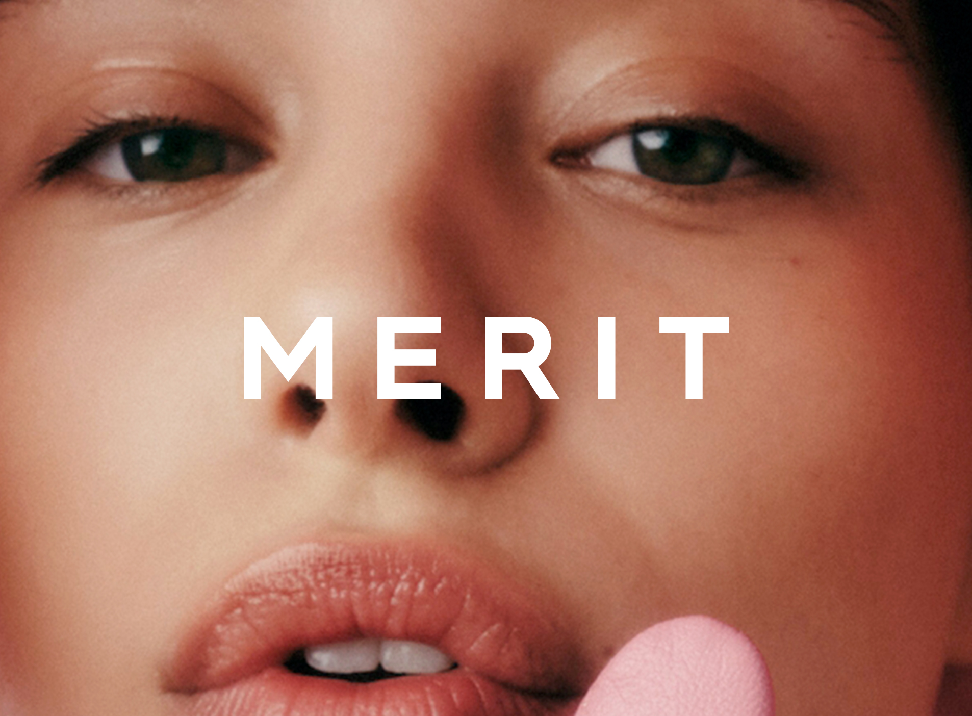
Merit's logo needed to feel unfussy and confident, a reflection of rest of the brand vision. I developed a strong, simple type-based logo that could stand alone or overlaid on imagery or easily impressed on product and would read like a high-end fashion-inspired brand.
Packaging Exploration
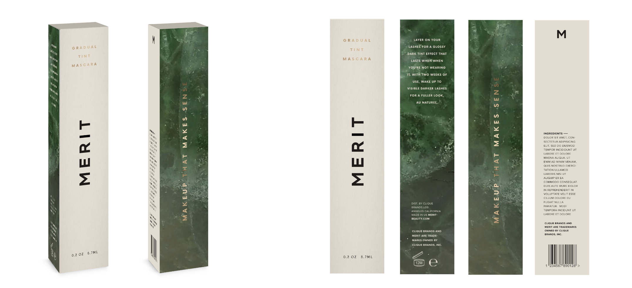
Taking those guiding principles, packaging exploration began. We wanted everything to feel understated but luxurious. Neutral tones and high-end materials we utilized to convey this. A very small sampling of both primary and secondary exploration scan be viewed below.
Unique Packaging Moments
Alternative secondaries that look simple but are innovative and luxe. The experience of opening the cosmetic should feel special and somewhat precious so these alternative slide-based cartons were developed.
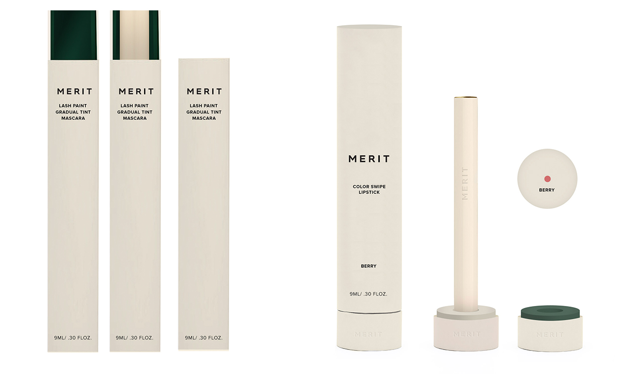
Photo Art Direction
