An aspirational, minimalist makeup brand.
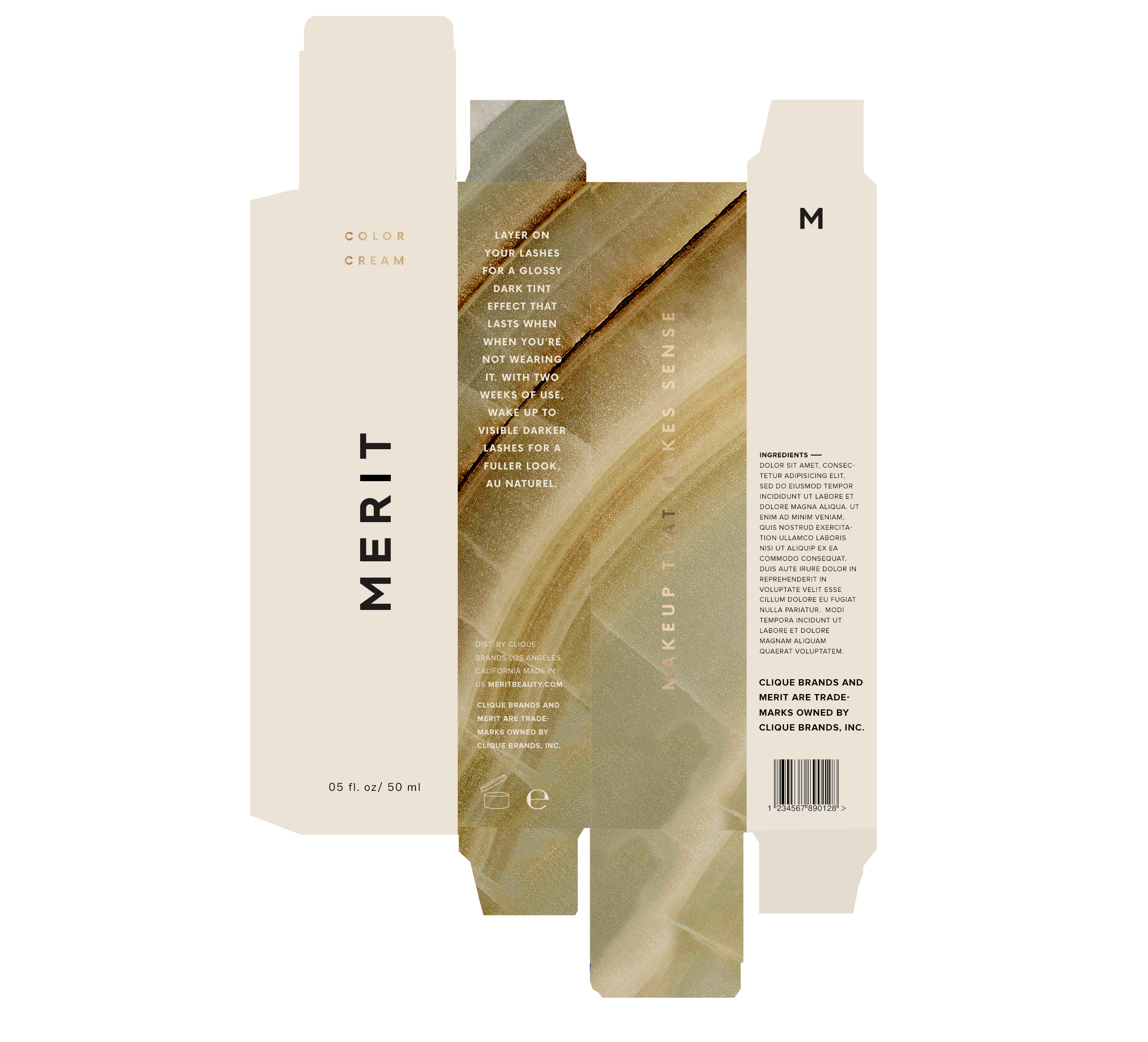
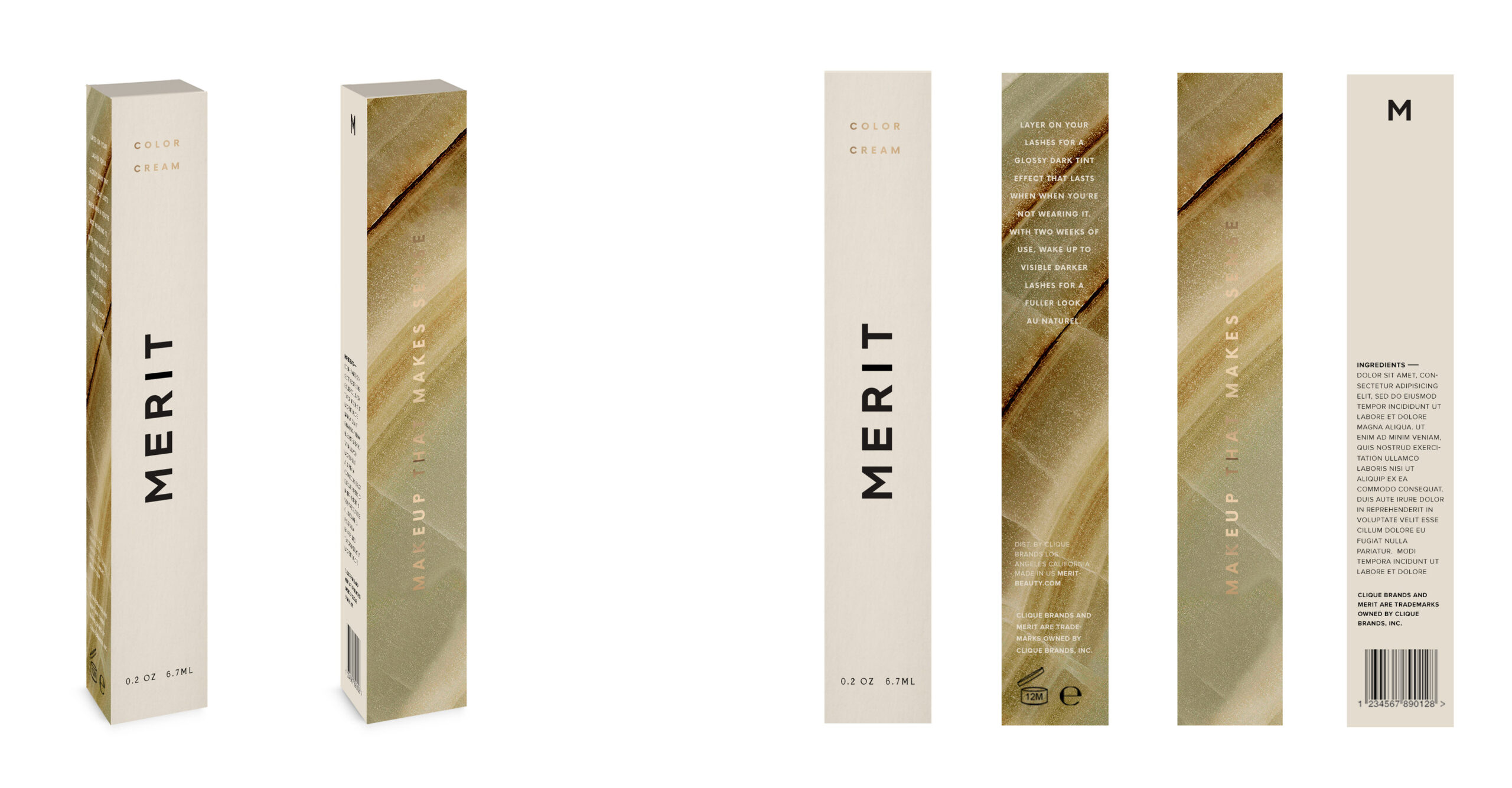
I was part of the development team for the brand, Merit. A minimalist beauty collection. As part of the team, I helped solidify the overall look and feel. Below is the logo I developed as well as the packaging iterations that did not go into production.

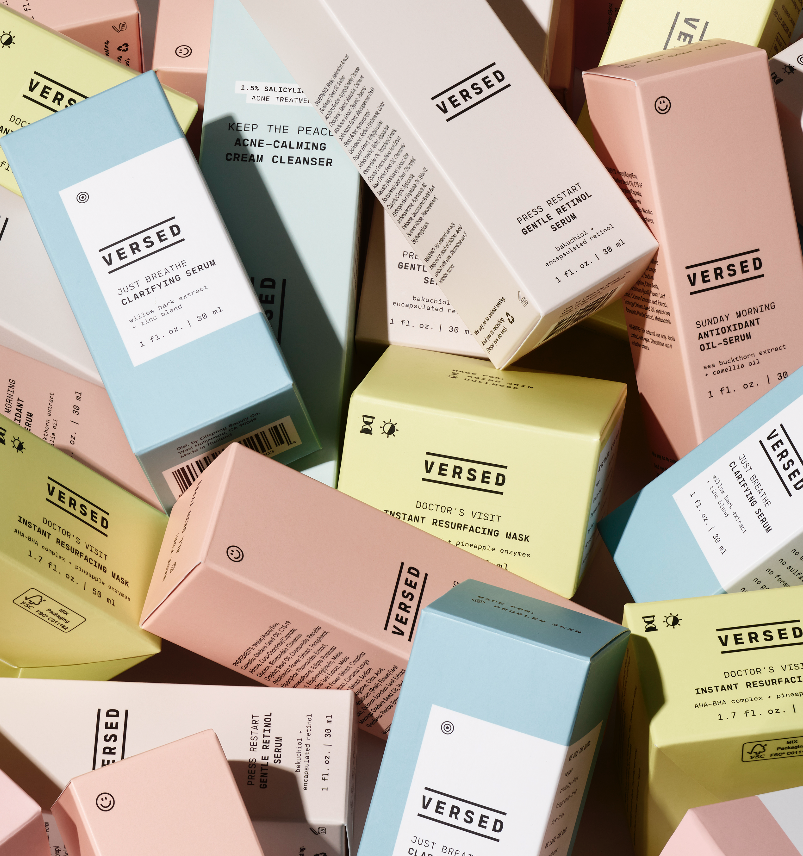
Versed uses its brand pillars to guide its packaging. It should be covetable but simple and chic with a mass appeal.
I have designed over 50 products for the line—most going into full production as well as into international versions of existing items. Being a mission-based brand, the packaging often acts as a vehicle for the messaging. All cartons are printed on recyclable FSC paper and most items are recyclable and are made with some percentage of PCR. The componentry is usually stock with minimal tooling to keep costs of goods low and the finished goods at an accessible price point.
I work cross-functionally with the product and brand teams from conception through to on-shelf presentation.
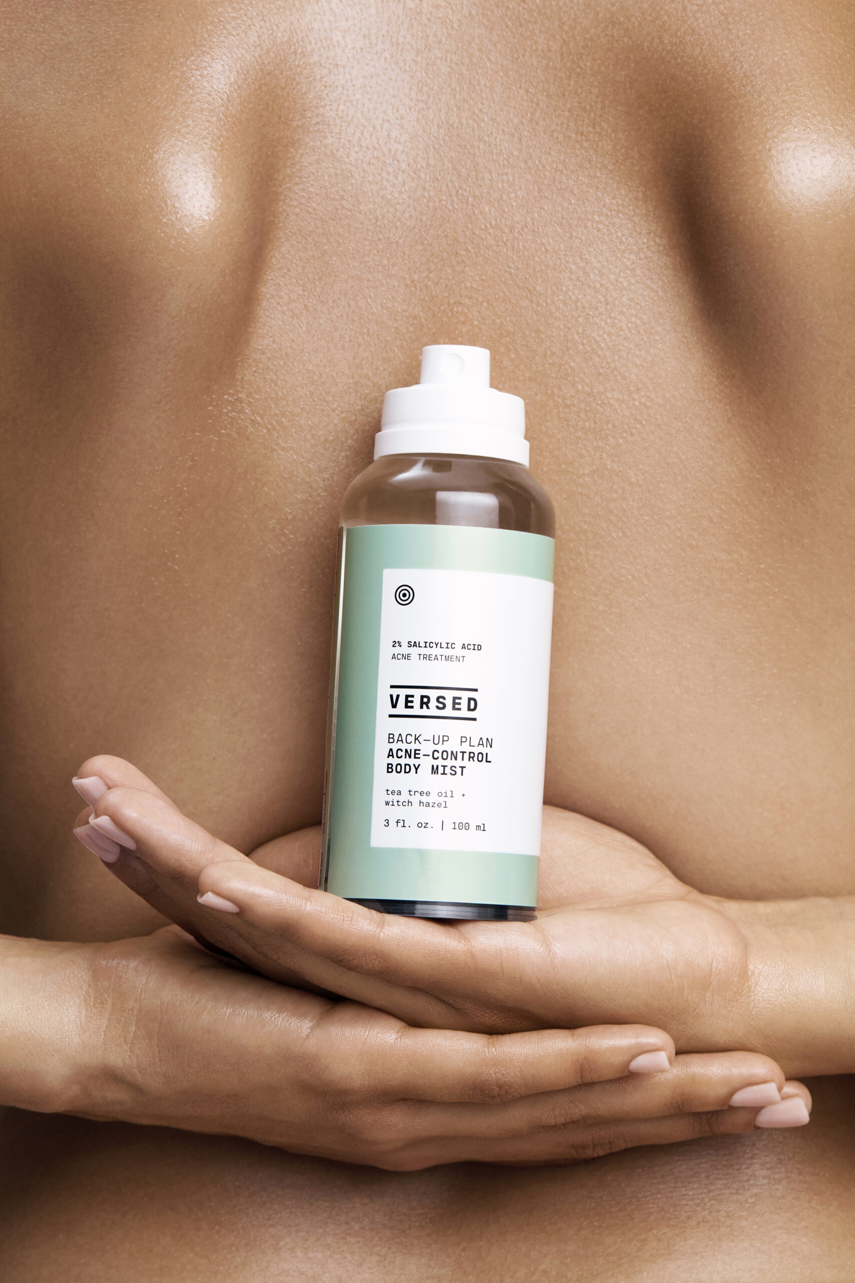
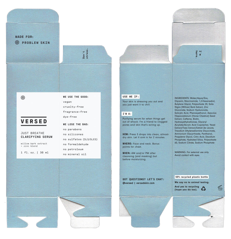
Skincare is an overly saturated and often confusing market. We researched the gaps and incubated a brand that was results-driven, easy to understand, environmentally-minded, and accessible. These pillars informed many design decisions, like easy-to-navigate icon systems, a clear hierarchy of information on packaging, high PCR content and FSC cartons.
Visually, the brand plays with juxtapositions. A utilitarian, slab serif set against poppy colors stands out on-shelf and is instantly recognizable in UGC.
